 They say it is evil. They say it can be put to macabre ends. They say the Devil uses it in his daily briefings to the hapless denizens of the Elysian Fields (ok, I made this up).
Yes, that's how much people hate Powerpoint.
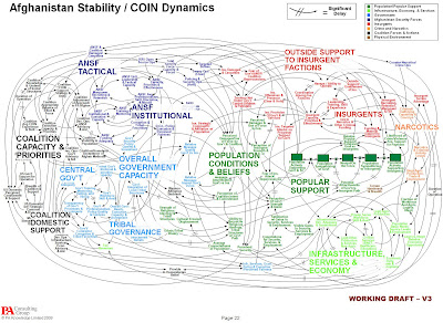
This image, from a Pentagon press briefing, has been doing the rounds in the interweb (is there a unified term for the blogosphere and the twitterverse, btw?). This NY Times article describes the surrounding peals of cynical mirth, as people tell each other - I told you, Powerpoint sucks - before going back to making their next 'deck' (need to brush harder tonight to get the taste of that word out!).
The problem has never been with Powerpoint as with the people using it. Even Edward Tufte, the Grand Duke of all things visual and a man who never hesitates in throwing his punches, criticizes the cognitive style of making slideware more than the tool itself. That the software makes it easy to throw out verbose texts and incoherent fragments in no time does not mean it has been spawned by Beelzebub himself during one of his ghoulish afternoons. This is one case where you should shoot the messenger (preferably with bullet points), and not the medium.
Take the above image. For one the resultant spaghetti has nothing to do with Powerpoint - it is at worst, a failure of depicting the information. In fact, one could even argue the image brilliantly depicts the hopelessly tangled web that is the Afghan situation! The choice of colours & clustering makes it a lot more palatable than some of the simpler images I have had the misfortune of seeing in several business presentations. We do not know how this slide was used and whether it was used to make a larger point of the complications, followed by diving into specific regions of this dense map.
The basic problem is that people gravitate towards using slideware as a communication medium even when it is not required. Hence, ppts show up in routine meetings merely as a visual notebook substitute for the presenter. Or they are used as means to document information. Hardly any presenter is taught effective use of a tool by way of the right techniques for narration, outline, slide & chart design, or using it as a complement to the presenter rather than a body double.
Fortunately, there's a ton of material available these days from which to learn. Garr Reynold's Presentation Zen is an excellent place to begin; there are many examples & contests on sites such as SlideShare; TED contains a wide ranging collection of different presentation styles; these are just a sample of resource map of people, ideas, and content devoted to telling better stories and sharing information effectively. If you are really serious about exploring an alternative to the entire philosophy of Powerpoint, try the awesomeness of Prezi. It provides a non-linear way of arranging your content, backed by some very pleasing frameworks for transition and narrative structure. In fact, this is so cool that it forces you to completely alter your way of thinking about presenting.
So put down the pitchfork, take your mouse away from the Add/Remove Programs, and take a deep look inside your slides before you get booked for cognitive murder.
1 comment:
Good post
I am having my doubts about PA Consulting Group! :-)
Post a Comment